Support SF Schools - Visual Language
I led the design of Support SF School's visual system, establishing visual principles, styles, and graphics.
Summary
While we are still refining and iterating on our visual process, here is a look at our current visual system and branding.
You can check out the end to end design process here.
Team
James Davis — Designer
Timeline & Status
September 2023 - Present, MVP
Visual Principles
Building a Design System that Embodies our Mission
The design system reflects the platform's core values of inspiring community impact through engaging, inclusive content. I led a design workshop to brainstorm key words representing our mission to help guide our visual principles.
Playful
Our approach encourages a sense of joy and exploration creating an engaging experience on our platform.
Impactful
Our mission is to drive meaningful change through every action, whether through educational advancements, community support, or fostering civic responsibility.
Engaging
We focus on fostering active participation and sustained interest, striving to make everyone feel included in our mission and community.
Inspiring
We highlight stories of success and potential, motivating our community to take positive actions.
Inclusive
We are committed to making sure everyone feels welcomed and valued, providing equal access and opportunities for all.
Color styles
Designing a School Inspired Palette
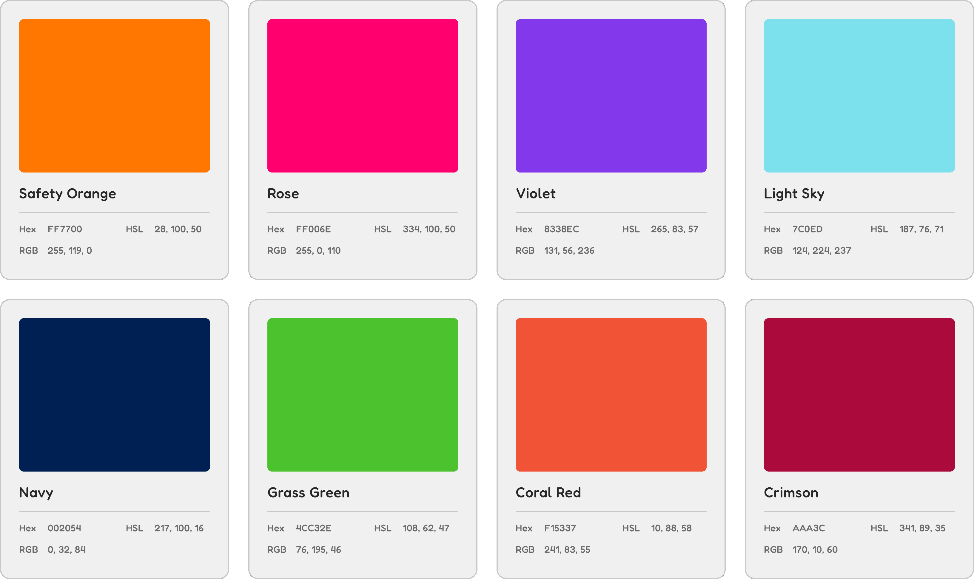
We wanted to reflect support for local educational institutions in our visual branding through bold, engaging colors that symbolize our commitment to fostering community engagement and creating a vibrant school atmosphere.
Core Colors
Our core colors compliment each other to convey playfulness and impact. They are used to highlight areas of attention, typography, and primary backgrounds.

Secondary Colors
Our bold secondary colors are employed across our UI, illustrations, statistics, and branding, adding vibrancy and visual impact to our overall design.

Neutrals
Our neutrals are used for typography, hierarchy, and negative space - ensuring clarity and visual balance within our designs.

Typography
Balancing Playfulness and Legibility
Our typographical choices, anchored by Fredoka, strike a balance between playfulness and legibility. This ensures our designs are not only visually engaging but also easy to read and understand.
Fredoka
Fredoka Bold is our typeface of choice for titles, headlines, and call out statistics.
Titles
Headlines
Statistics
Lato
Lato is used for body text and any section requiring a longer word count.
Body
Illustrations
Adding a Personal and Creative Touch to our Platform
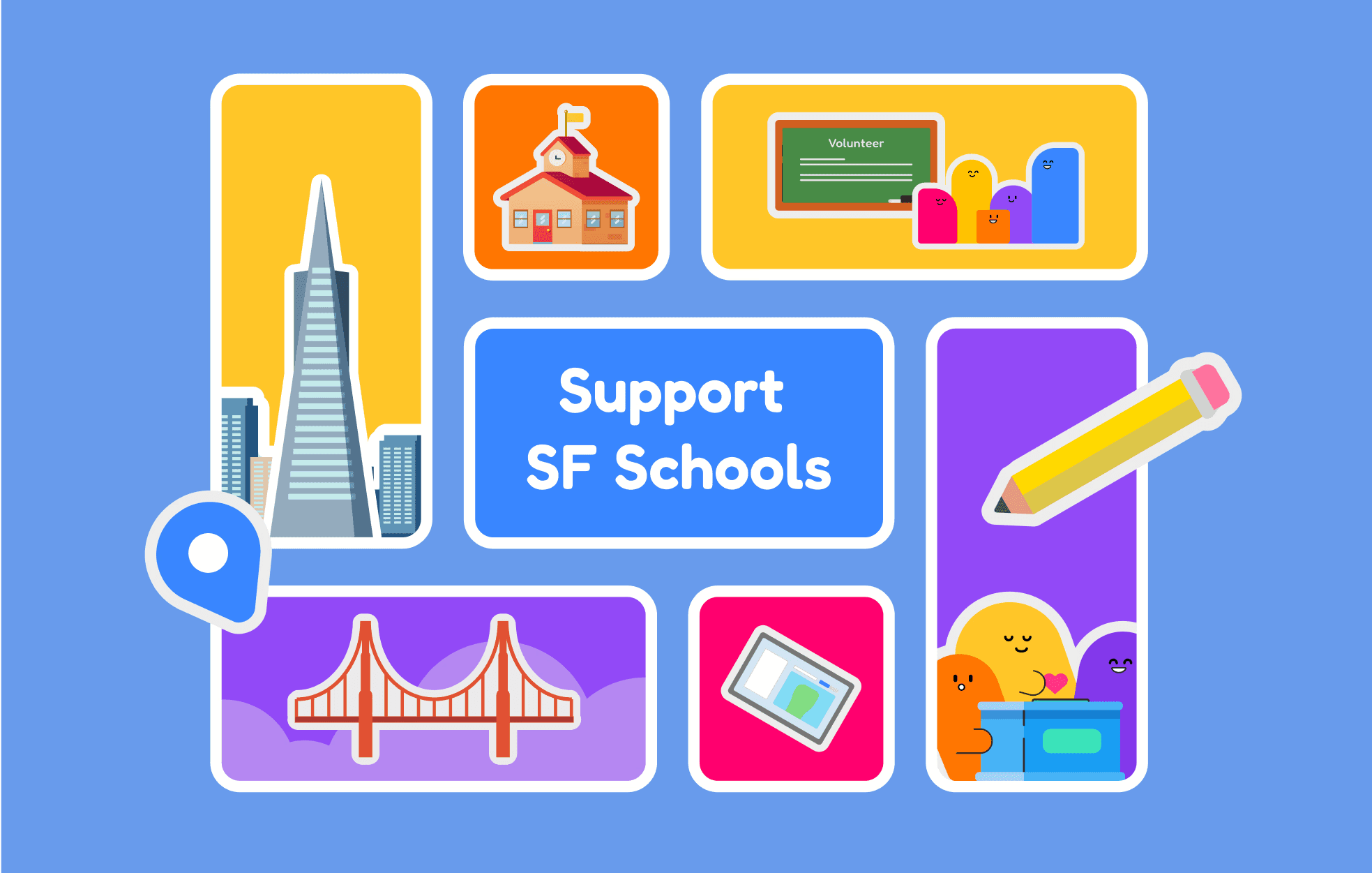
Our platform features simple graphic characters that embody the playfulness of our mission. These vibrant illustrations highlight our branding and personality, reflecting imagery of San Francisco and encouraging volunteerism and donations.
Key Illustrations
These key illustrations are used for our hero and about pages, and out volunteering and donation sections.

Illustration for our "About Us" page, highlighting SF, education, and tech

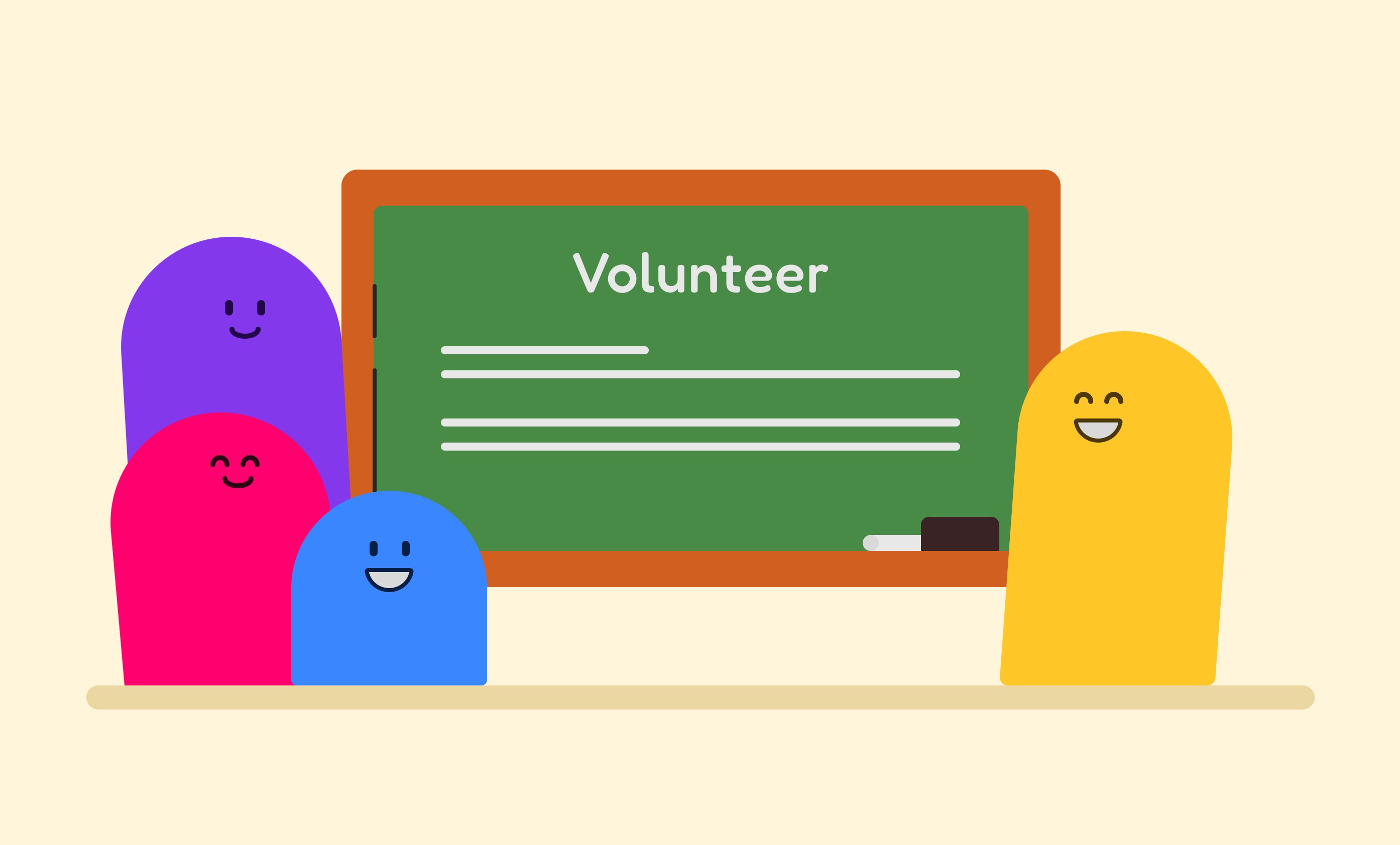
Volunteer section illustration conveying educational opportunities

Donation section illustration, conveying the impact of giving

Hero page illustration blending a traditional schoolhouse with the city
